
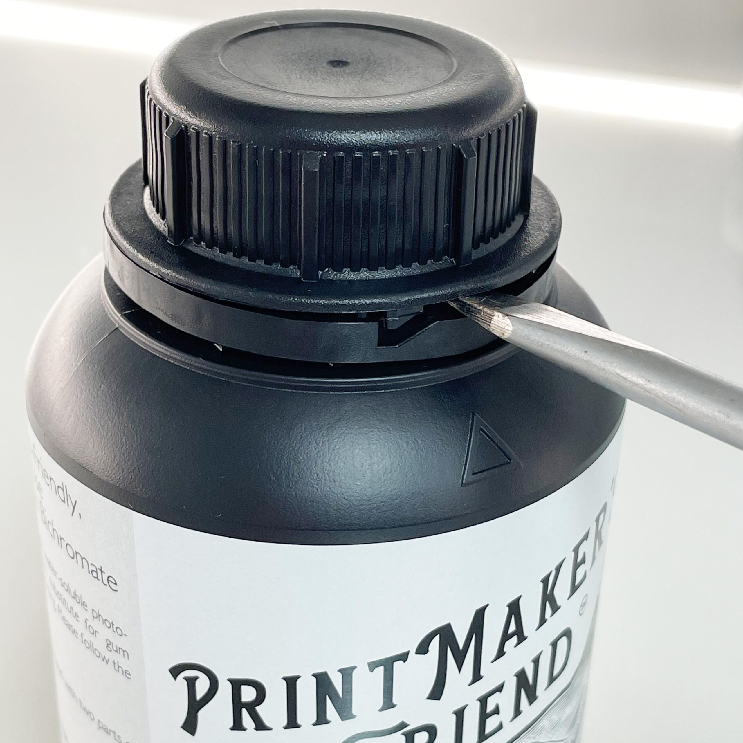
 Opening Bottles-The bottles can be difficult to open the first time because of the tamper-evident seal. The bottle is much easier to open if you break this seal first. This can be done with a flathead screwdriver, a coin, a credit card, or any other flat, thin, and hard object. Printmaker’s Friend is about 10x more sensitive to UV and Blue light than dichromated gum, so open in yellow or very warm lighting such as 1700-2000k.
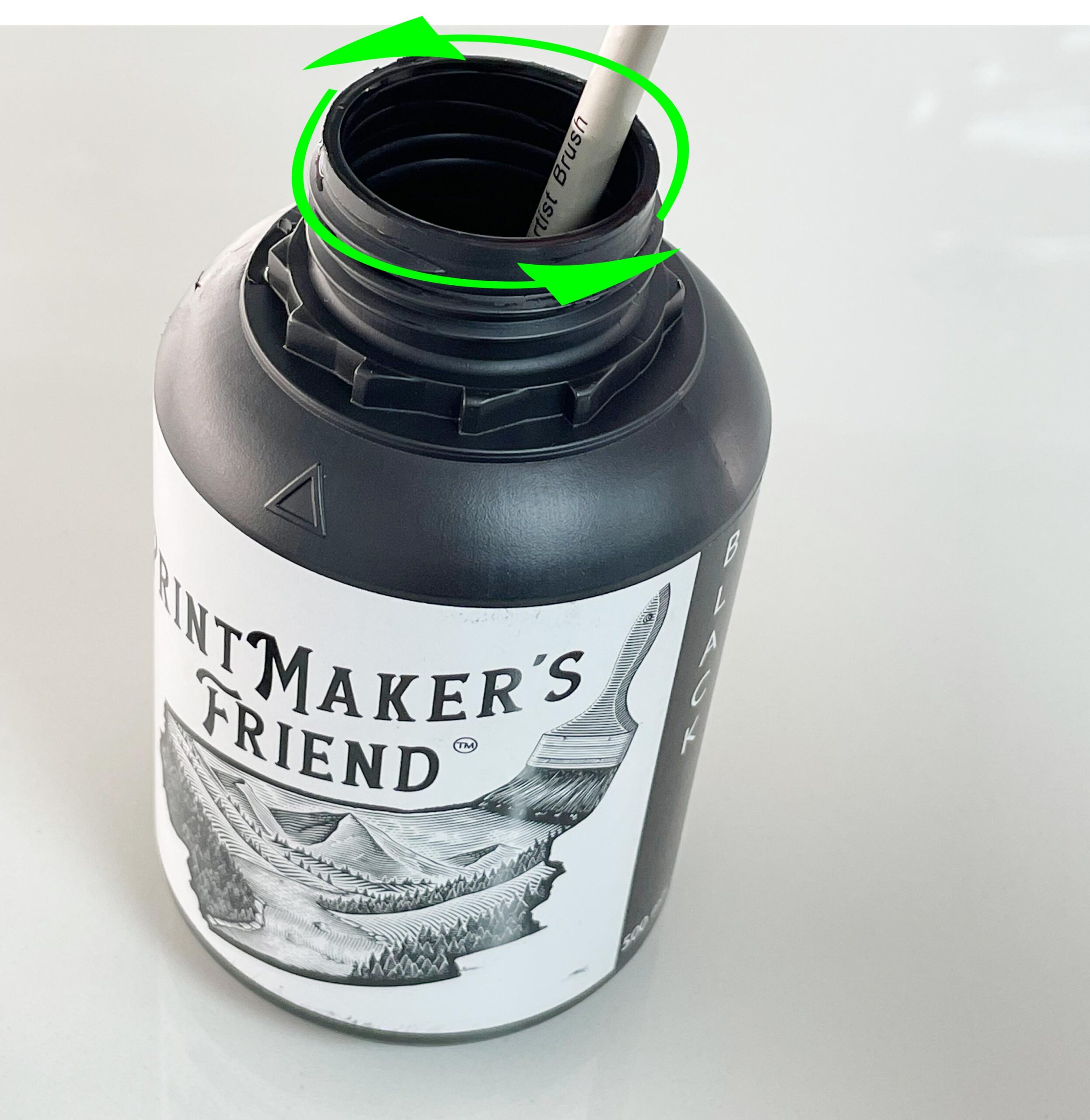 Stir Black– The dispersion of the CMY and Lk pigments are excellent and no sedimentation will occur. The pigment used in the black emulsion produces a beautiful velvety black, but the tradeoff is a slight bit of sedimentation. Every time you use the black emulsion be sure to stir it for about 30 seconds with a small brush.
 Reticulation: PrintMaker’s Friend wants to expand during development. Printing 100% of each layer will lead to severe reticulation in the print as seen in the photo to the right. This is easily solved by limiting each layer to 80%. In the photo, the left border has no ink limiting, while each layer in the image was limited to 80%. To apply an ink limiting curve, after separating channels and applying any tonal separations, open a curves adjustment layer and lower the black point from 100% to 80%. This will make calibration much easier as well. When making linearizations, lower the 100% patch to 80% on the step chart before inverting. For more information see page 68 in the Separations guide of Calibration for Alternative Photographic Processes.
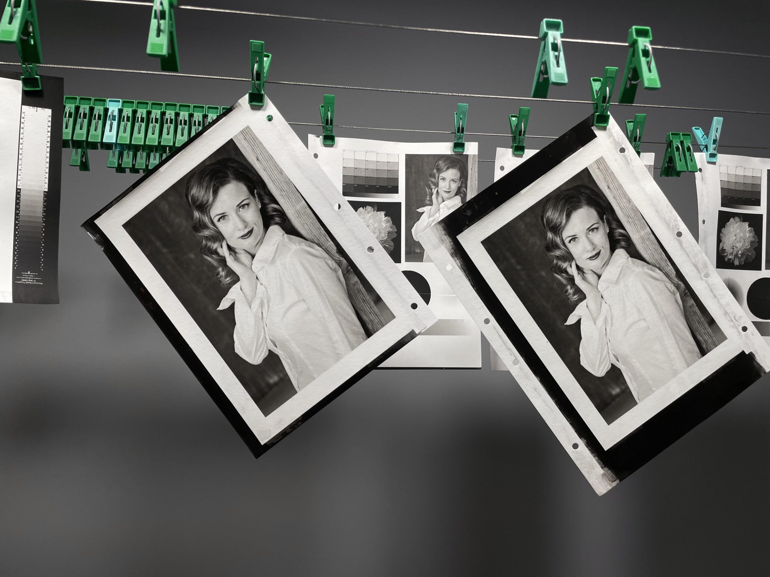
These are some eco-polymer prints I made with PrintMaker’s Friend and the profiles below.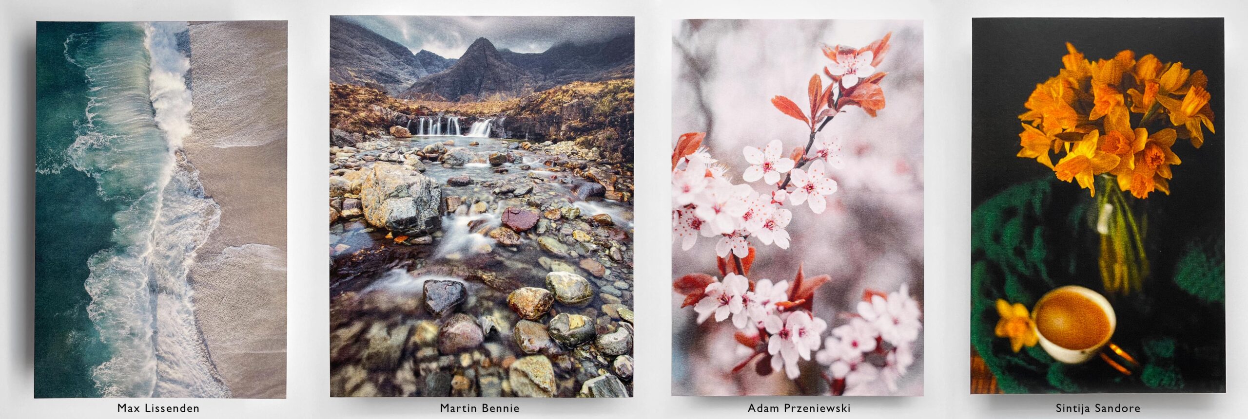
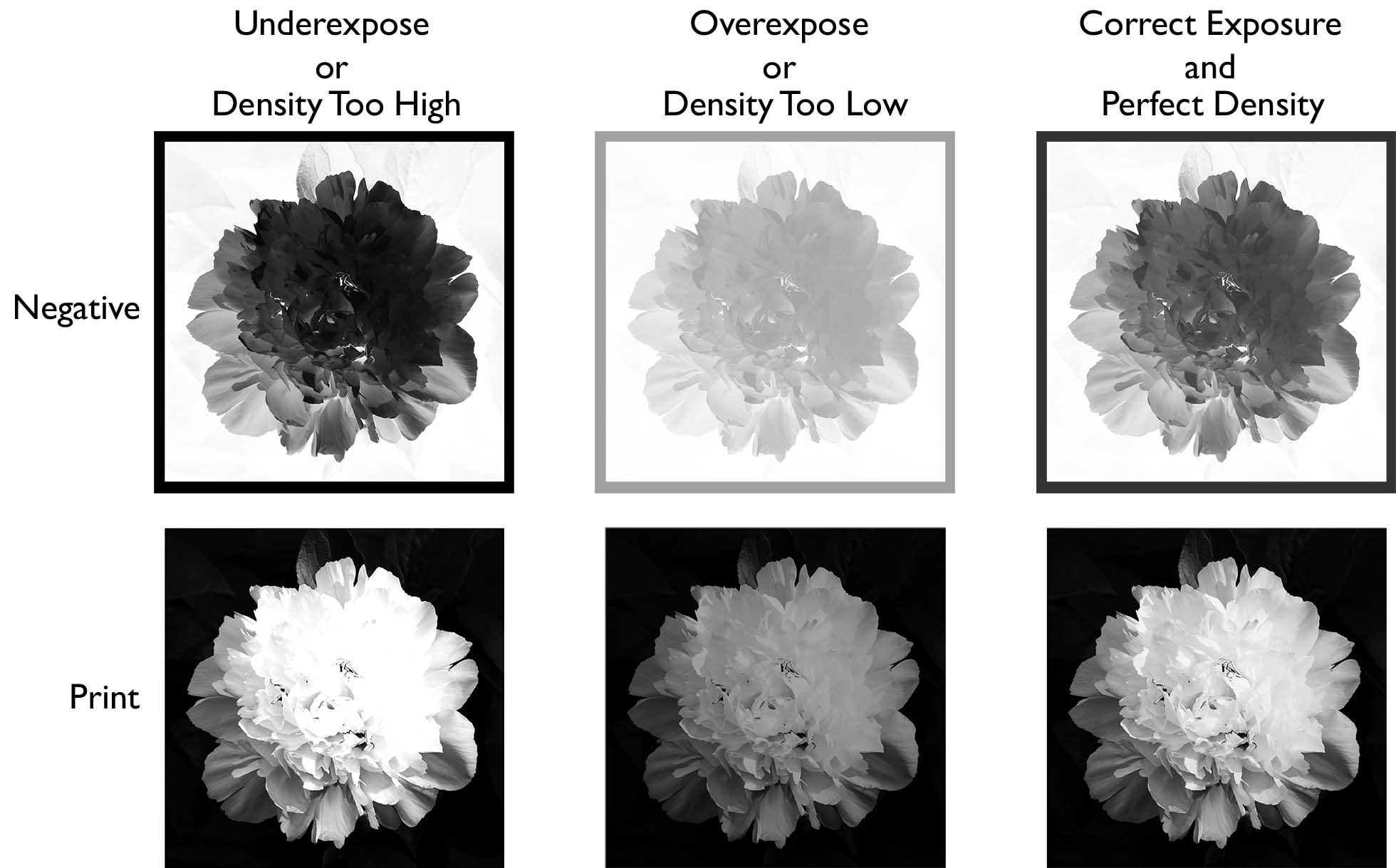
Whenever using continuous tone negatives, we must match the process to the density of the negative or adjust the density of the negative to the process. Failure to do so will result in muddy or blown-out highlights, as shown in the image below.
It is easy to adjust the density of inkjet negatives, so we will start by creating an ideal process, and then adjusting the negative accordingly. For silver-based negatives, once the negative is made, changing the density is not always possible. In this case, we will adjust the process to match the density of the negative. Because of these differences, the workflow for inkjet and silver negatives varies slightly. Choose the tab below for the type of negative you will be using.
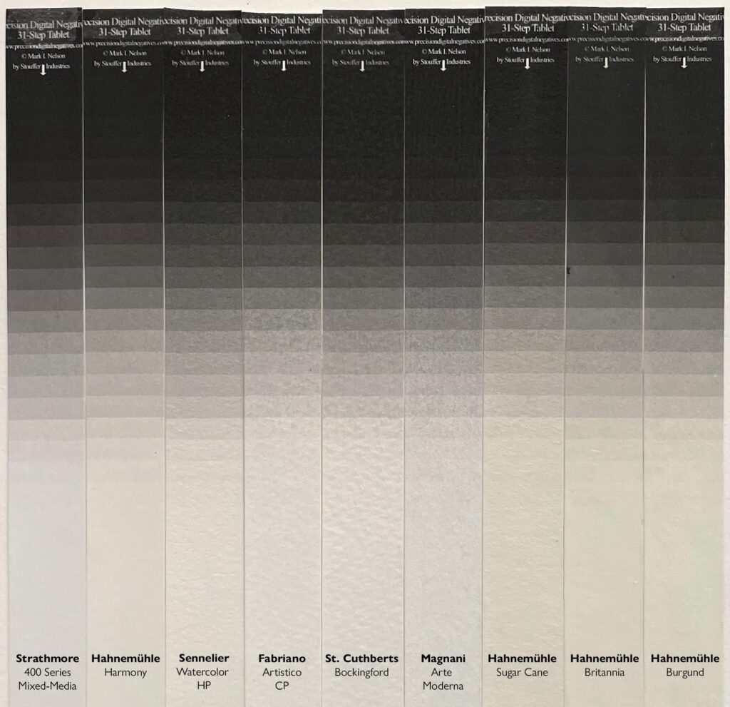
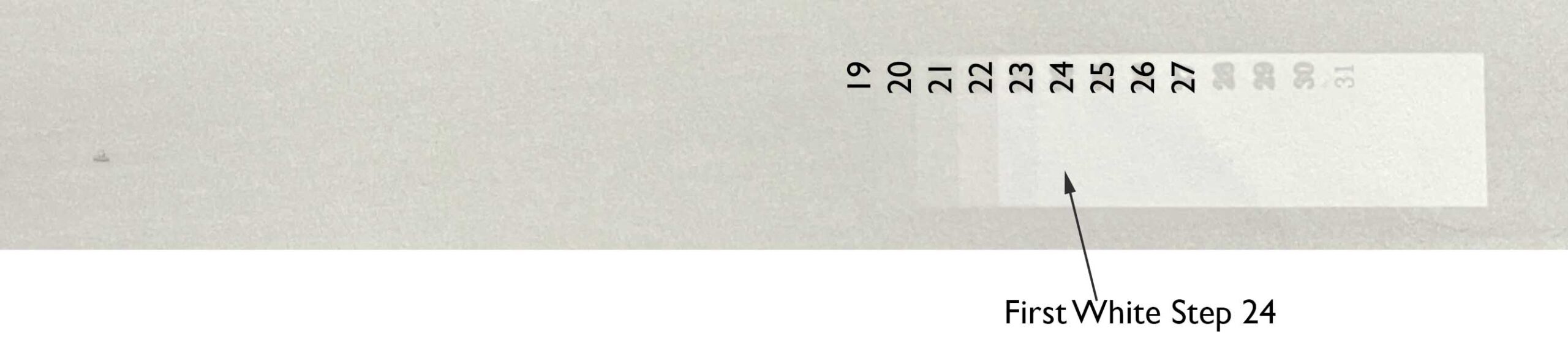
STEP 2: You will need T3110 Stouffer transmission step wedge, or similar. It’s possible to calibrate if you don’t have a Stouffer step wedge, but I don’t recommend it. Having a good reference will make the calibration process a lot easier. Start by coating a small strip of paper with the layer 1 emulsion. Stir the emulsion well before coating. Let it dry, then expose it for a random amount of time with the Stouffer step wedge. Develop in tap water for about two minutes. We want step 20 to be the first white step, which would indicate the correct exposure for a negative with a density of 2.0. The photo below shows the first white at step 24, so we need to decrease the exposure by 4 steps.
Use the table below to calculate the correct exposure time. In the overexposure example above, the difference between step 24 and step 20 is 4. Following the table below, the exposure was 2.51 times too long. If the exposure was 100 units, we need to divide the exposure by 2.51, which means the correct exposure is about 40 units.
|
Steps Away from 24 |
Multiply or Divide Exposure Time by |
|
1 |
1.25 |
|
2 |
1.58 |
|
3 |
2 |
|
4 |
2.51 |
|
5 |
3.16 |
|
6 |
4 |
|
7 |
5.01 |
|
8 |
6.31 |
|
9 |
8 |
|
10 |
10 |
|
11 |
12.6 |
|
12 |
16 |
|
13 |
20 |
STEP 3: Calculate the exposure times. Follow the table below to calculate your exposure times. If the correct exposure in the example above was 40 units, then multiply every value in the table below by 0.4. The first layer will be 40 units, the second 33.2, etc…
|
Exposure Time or Units |
|
|
Layer 1 |
100 |
|
Layer 2 |
83 |
|
Layer 3 |
62 |
|
Layer 4 |
41 |
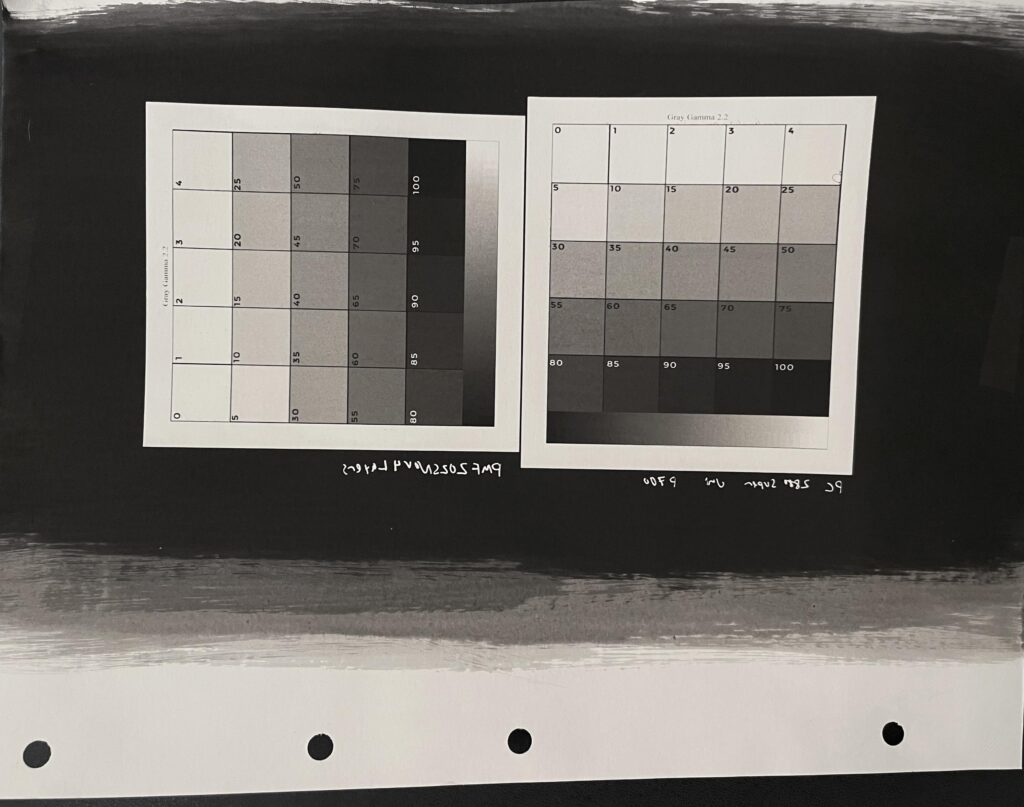
STEP 4: Create a digital inkjet negative that has a density of 2.0. There are many systems out there for doing this. I think Peter Mrhar’s Easy Digital Negatives is great. I use QuadTone RIP, but it has a steep learning curve. You can also look at Richard Boutwell’s tools and Piezography for more control. Most of these systems will have some sort of chart that has various levels of ink, like the ones shown in the photo below. This video may be helpful.

Start by printing one of these charts. Then you will need to expose it with the coated paper.
Look for the amount or combination of inks that produces a good tonal scale, and a good white. In my case, with QTR and an Epson 3880 I found that 75% of the photo black ink produced a good white. If there is a lot of speckling in the print, then you most likely dried it too much or overbrushed the paper.
STEP 5: Print a step chart to linearize the process.
Use this tool, or any other system you are comfortable with to create a linearization curve.
STEP 6: Apply the curve from step 5 to the image you want to print. Remember to flip the image. Invert it. Print with the same settings as you did for the test chart. Follow the same coating, exposing, and developing procedure as in step 3. I recommend playing around with the color of the layers. For example, adding a tiny bit of iron oxide to the first two layers, and some cyan+magenta to the third and fourth layers will add a nice split tone. Below are some straight BW 4-layer prints.
Ideally you want a negative with a density of 2.4, but anything from 1.8-3.0 will work. The density of the negative will determine how many layers and exposures will be used to make the print. Higher density = more layers. Below 1.8, the number of layers drops to three which causes staining in the highlights and makes it difficult to achieve a dense black. When making silver negatives, develop the film for about twice the recommended time. Normally this approach would cause a fair bit of staining in the negative, but Delta 100 works quite well when overdeveloped. You want it to be dense! Borut Peterlin makes some of the best negatives I have worked with. I highly recommend his workshops.
Start by making stock solutions in beakers following the recipes below. These don’t correspond to any specific layer, and will probably need to be adjusted.
Clear | PMF Light Black | PMF Black | Water | |
A | 33g | 7g |
| 100g |
B | 20g | 20g |
| 100g |
C |
| 40g |
| 100g |
D | 28g |
| 12g | 100g |
E | 17g |
| 23g | 100g |
F |
|
| 40g | 100g |
Step 1: Determine the density of the negative. Start by coating a sheet of paper with the B emulsion and let it dry. Place the paper and negative face-to-face and bracket exposures. If there is a sky or white shirt (the lightest part of the image), this is the part of the image you want to focus on. Expose the white area for a random series of times, for example, 8, 12, 16, and 20 units. Develop in tap water for two minutes. You are looking for the shortest exposure that has tone, or the longest exposure that still has pure white in the image. All you are looking at is the white point, don’t worry about the contrast of the rest of the image. In the example below the ideal exposure should be between 4 and 8 units. (photo by Jesper Korneliusen)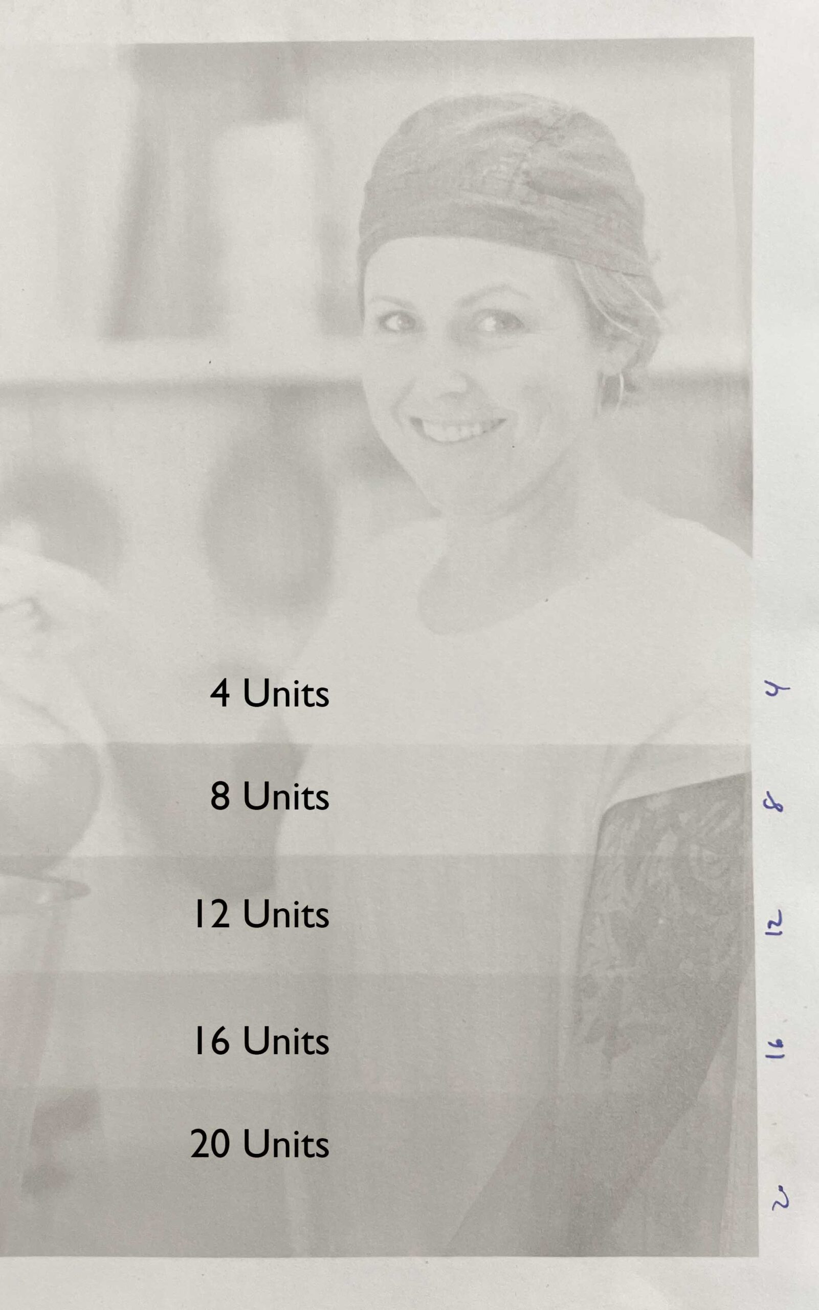
You can repeat the process and fine-tune the exposure, or just guess that it should be about 6 units. It’s unlikely you will get this close on the first try. Most likely the exposure will be way too long (when you develop, none of the PMF washes away), or way too short (all the PMF washes away and no image is visible).
Step 2: Coat a small piece of paper with the B emulsion and let it dry. Put the paper face to face with a Stouffer step wedge and expose it for the time you calculated in step 1. In this case, we’ll expose the step wedge for 6 units. Develop the step wedge for two minutes in tap water and look for the first step that has a pure white. This tells you the density of the negative. In the photo below the density is 2.4.
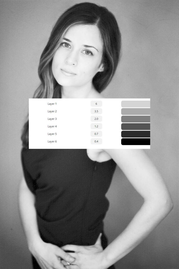
Step 3: Enter the exposure time and negative density into this Separations Calculator Tool. Notice how the density of the negative determines the number of layers. The separations calculator will provide exposure times and the number of layers, as well as the color for each layer. If you want to use a spectrophotometer, here’s an excel file that provides the same information with luminance values.
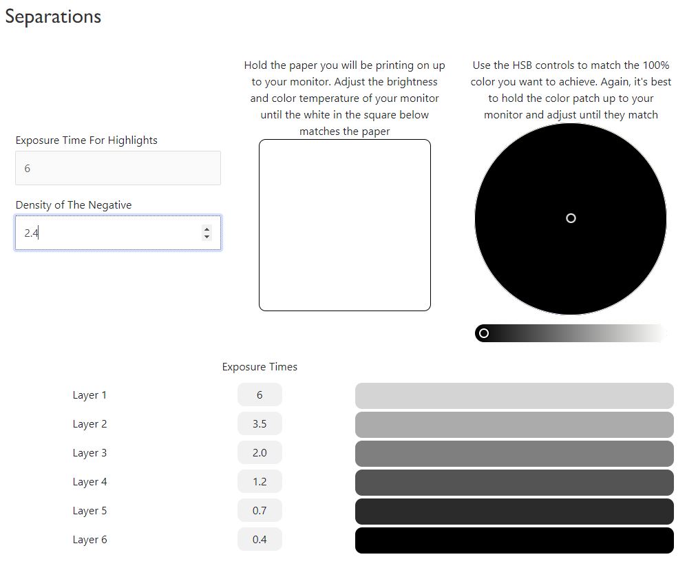
Step 4: Next we need to adjust the stock solutions of PrintMaker’s Friend so they match the patches shown in the separations calculator. We can do this either visually or with a spectrophotometer. For visual matching, adjust the brightness and color temperature of your monitor until a piece of white paper matches the white on your screen. You can also take a screenshot of the patches and print them.
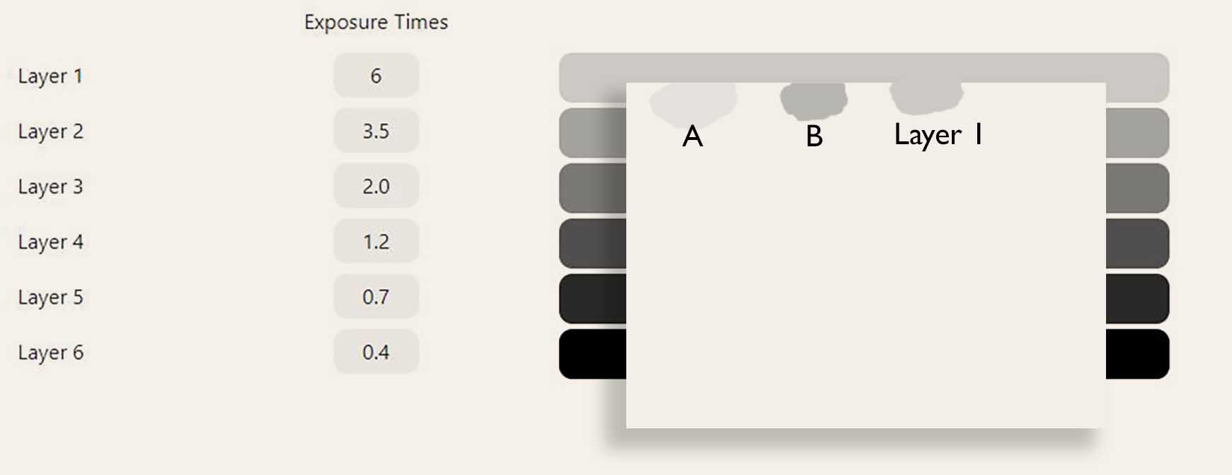
With a small brush, about 5-10mm wide, coat a small patch of the solution A and another small patch of the solution B on a sheet of paper. Hold the two patches up to your screen, next to the printed reference, or read them with a spectrophotometer. We are looking for the best match. In the example below, neither matches perfectly. A is too light and B is too dark. Let’s mix them together in equal parts, and test. Great, it matches perfectly, so we’ll call this Layer 1.
With a larger brush, coat the whole sheet of paper with Layer 1. Let it dry, then expose it with UV light.
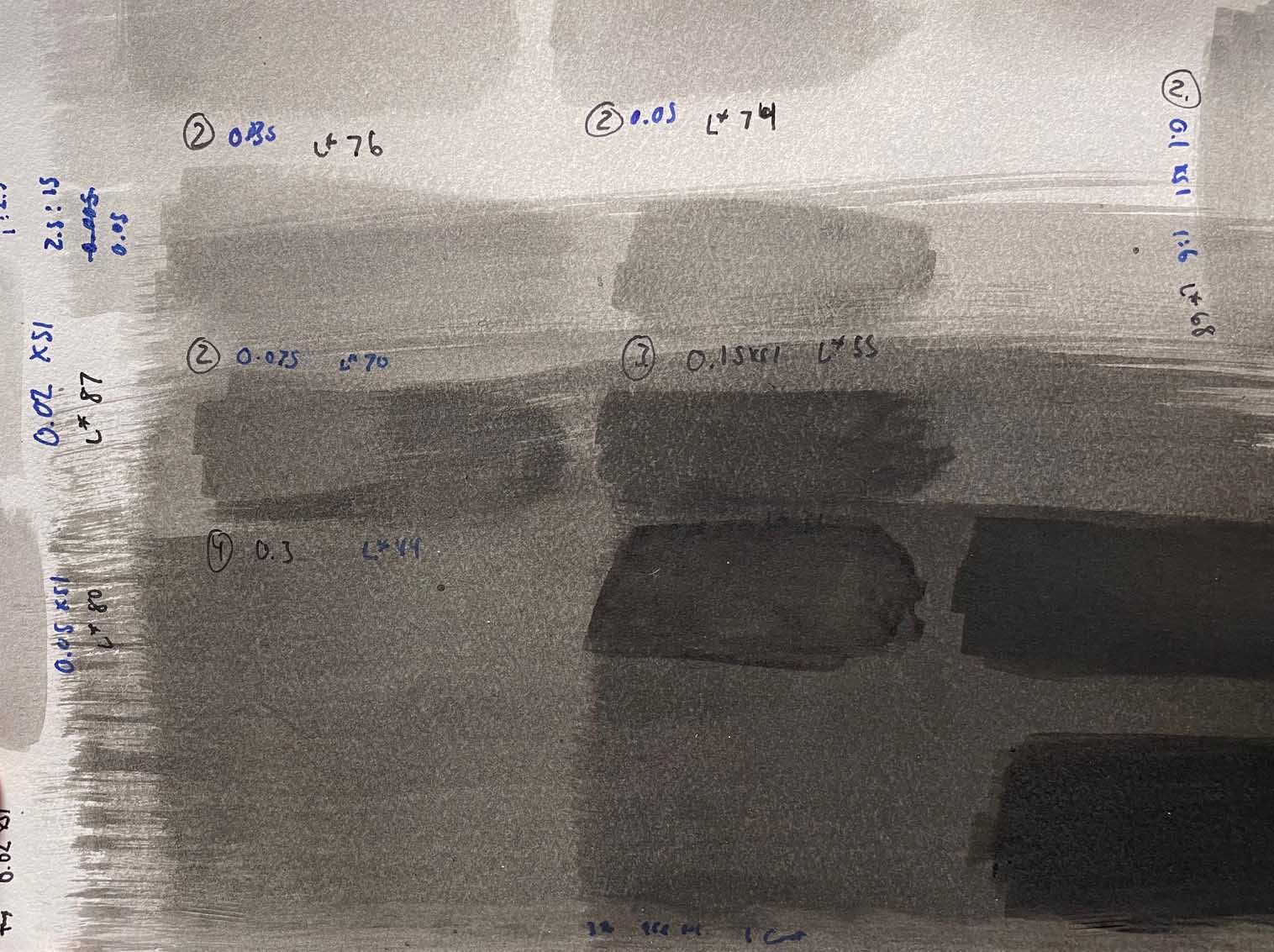
With the small brush again, coat some solution B and C on top of Layer 1. In the example below it looks like solution C matches perfectly. Label this as layer 2. Then, with a larger brush, coat the remaining paper without patches on top of Layer 1. Let it dry then expose it with UV.

Continue with the remaining layers. You should end up with something like the chart below.
Step 5: Make a print using the exposure times from step 3, and the recipes from step 4. Coat a sheet of paper with the layer 1 emulsion, dry, and expose. When you coat the second layer, coat quickly, you don’t want to melt the first layer. Dry the second layer, then expose. Do this for the remaining layers, then develop once all layers have been coated and exposed.
Step 6: Up until now we have been concerned with matching the exposure of the process to the density of the negative and creating a nice smooth tonal scale with no banding. Now we must adjust the contrast of the process to the negative. The easiest way to do this is to take a photo of the print and bring it into photoshop.
In the example below, the print is too light.
To change the contrast of the process we are going to change the pigment concentrations of the layers. Remember, the exposure time dictates where on the tonal scale the tone is placed, and the pigment concentration dictates how light or dark a layer is/the contrast of the print. This is why a long exposure is used to place the light tones in the highlights of the print, and a short exposure is used to place the blacks in the shadows of the print. If the print is too light, we need to use a higher concentration of pigment, but how should the pigment concentrations be adjusted? We have a reference that we used to create the original recipes for each layer, so lets add that to our image in photoshop.
Now adjust the image with a curve until the image looks good. I covered up the left part of the reference patches so you can see the difference. The left patches show the original goals, and the right shows the new goals.
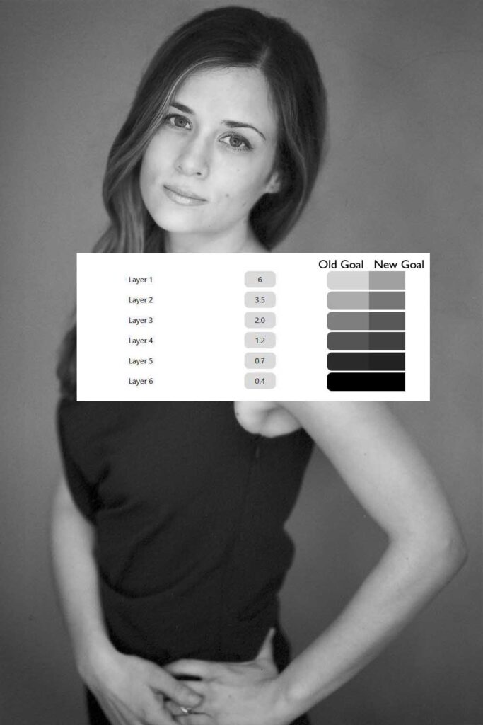
Now we just need to repeat step 4, matching the new goals. If you are using a spectrophotometer, you can read the gray value of the patches in Photoshop, then use this solver to calculate the new goal Luminance values.
Step 7: Make a print. The exposure times are the same as before, just the recipes for each layer have changed.
It’s a lot of work to get to this point. It takes me about four hours to go through this whole process. However, once I figure out a calibration for a single negative, as long as the rest of my negatives are the same, i.e. Delta 100 developed for twice the recommended time, then I can just skip to step 7 and print.
Have fun with split toning, and well as dodging and burning. Anything you can do in photoshop with curves, toning, or dodging and burning, you can do in the analog world with PrintMaker’s Friend.
