Alternative photographic processes are often very difficult and choosing the wrong pigments can add to the frustration. Ideally each ink, dispersion, and paint would be tested for: staining, transparency, pigment loading, quality of the dispersion, mixability, sedimentation, toxicity, lightfastness, chroma, and for other defects they can cause. This is a hefty financial burden and takes a considerable amount of time. Below are descriptions of the tests I have conducted to find dispersions that work best with the carbon transfer and gum bichromate processes, but they will also work very well with other alternative processes and artistic ventures like producing your own acrylic or watercolor paints.

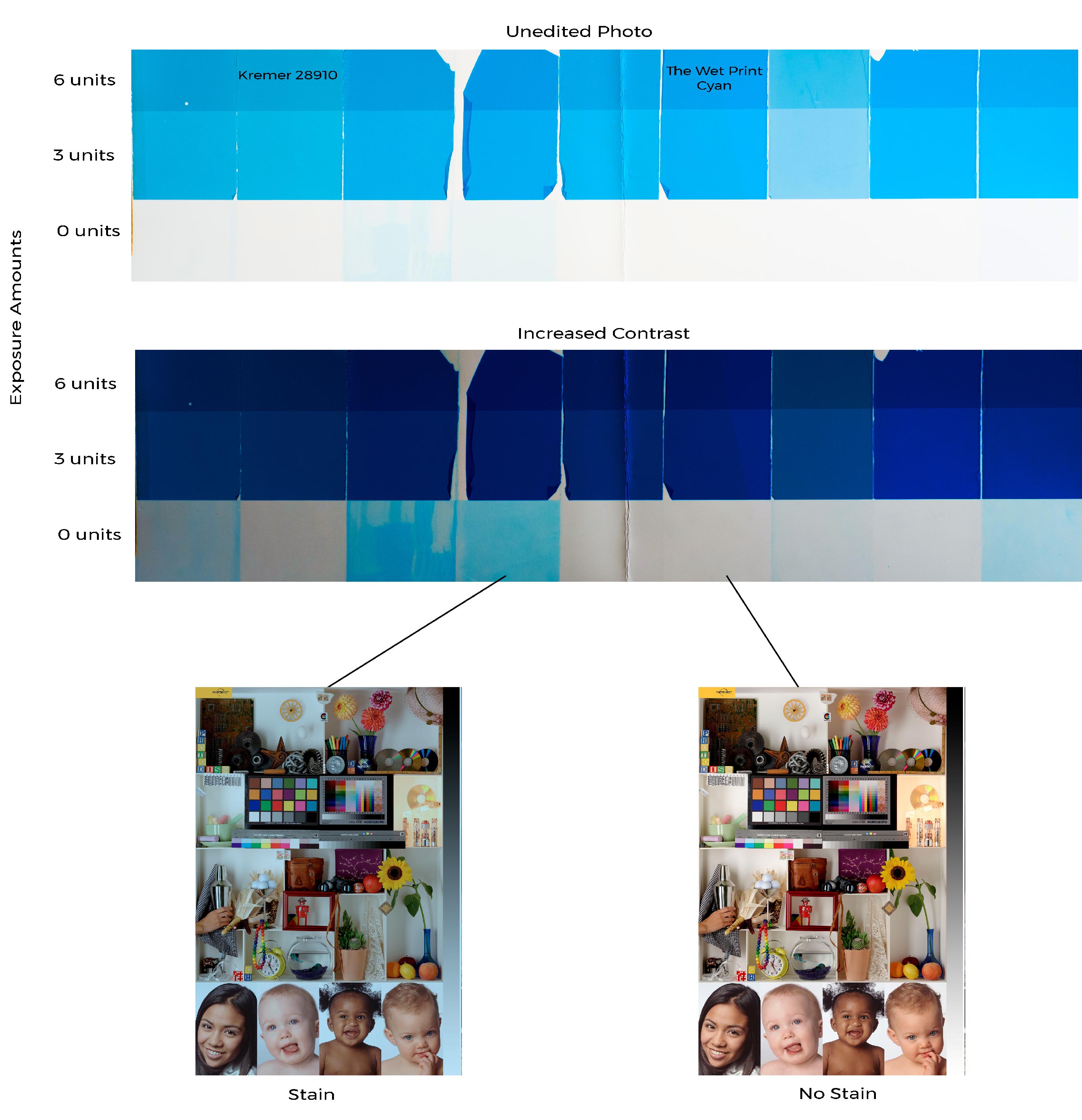
Staining happens when a pigment does not wash off completely during development. In the test above nine emulsions were made with various dispersions adjusted accordingly so that they all had the same amount of pigment. They were exposed for 0, 3, and 6 units then developed on a yupo support treated with albumen. The second photo shows the results with increased contrast. Imagine using the third or fourth dispersion from the left. The prints would have an awful cyan cast in the highlights. The dispersions with the least amount of staining will then be tested for transparency, mixability, chroma, etc… If the results are not good, then the process repeats. Around 40 dispersions were tested for staining of the magenta alone, and well over 200 dispersions were tested in total.
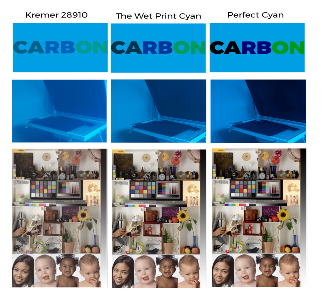
Transparency is another very important factor in choosing a dispersion for printmaking. Let us look at violet color in a print. To create that color cyan needs to be laid on top of magenta, or the other way around. If the cyan is completely opaque it will just cover up the magenta. As the cyan becomes more transparent, it lets more of the magenta through creating a much more vibrant violet. This is true of all color in a print. The higher the transparent of the cyan and magenta, the more vibrant color mixes are going to be. See the photo above. The first row of photos shows the transparency of each dispersion. Notice how the black, violet, and green are muddy in the first photo and how vibrant they are in the last one. In the second row of photos, the dispersions were poured on a temporary support and used as a camera filter. The last row of photos is a digital proof of what a print would look like using dispersions with various opacities.
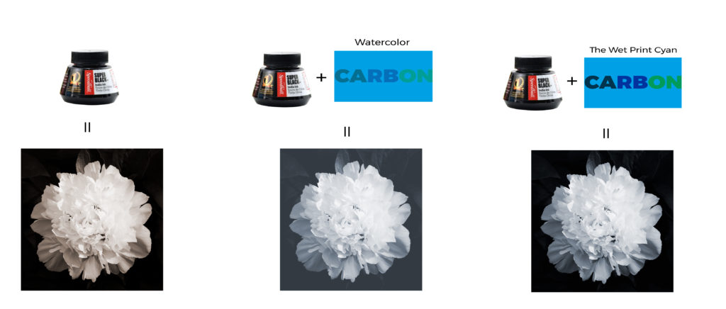
The opacity of the dispersions is also very important when tinting a black and white emulsion. Using a pigment with poor transparency will reduce the maximum density of the print substantially. See the photo below.
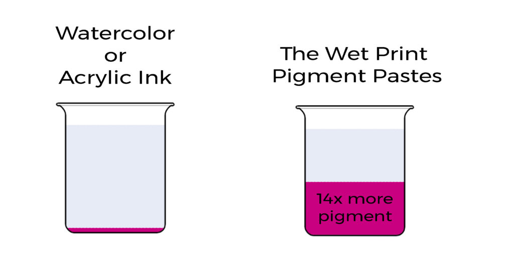
The higher the concentration of pigment in a dispersion, the less is needed to make a print. Look at the cost of 100g of pure pigment. The most common dispersions used to make a carbon or gum print are either watercolor paints or acrylic inks. The concentration of pigment in each is around 3%. To get 100g of pure pigment, about 3333ml would be needed. Watercolor tubes cost about 10 euros for 15ml, and acrylic ink costs about 5 euros for 30ml. The pigment from watercolor tubes would cost a little over 2200 euros, and acrylic inks would cost over 550 euros. The Wet Print color pastes are around 40% pigment, so the cost of 100g of pure pigment would cost between 28 to 70 euros depending on the color. A single pouch of The Wet Print color pastes will be enough to make around 100 to 200 8×10 photos.
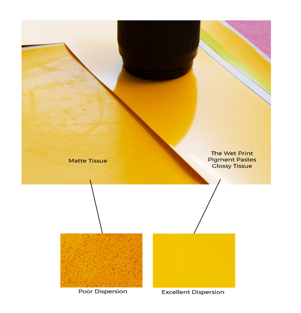
Dispersions with a small particle size and high stability will create more vibrant prints will smoother tones. A good indication of a quality dispersion is a glossy tissue and no sedimentation in the beaker. The dispersion must also easily mix into the gelatin.
Using non-toxic pigments is important because they will eventually enter a wastewater treatment plant and later into the waterways and soil. Using a cadmium or chromium based pigment would be irresponsible since other pigments offering the same lightfastness and chroma are available.
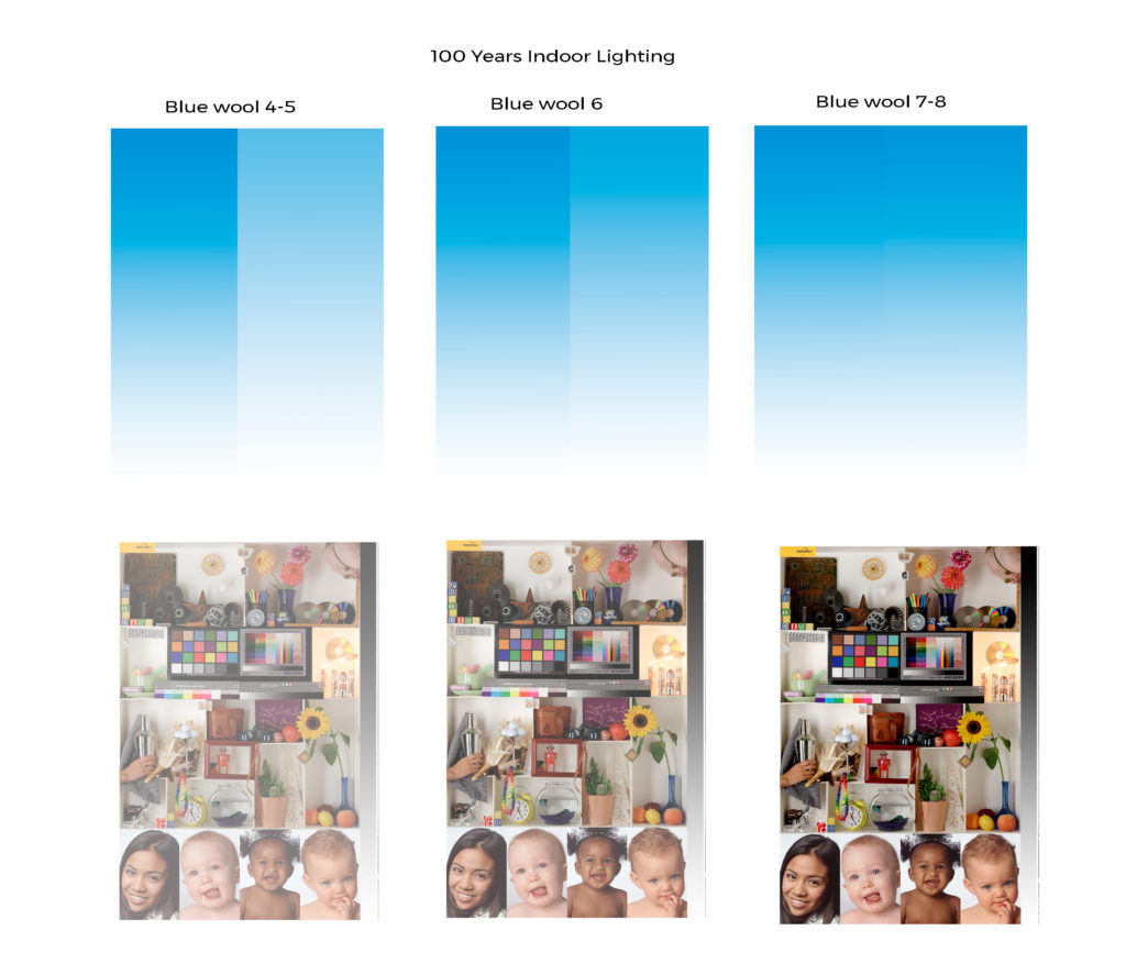
Making a print that is going to last hundreds of years is only possible if the right kind of pigments are used. Pigments with an ASTM rating of I or a blue wool scale rating of 7 or 8 will guarantee long lasting prints. The pigments used in The Wet Print color pastes are Benzimidazolone Yellow PY 155, Phthalocyanine Blue PB 15:3, and Quinacridone Magenta PR 122. Each have a respective blue wool scale rating of 8.
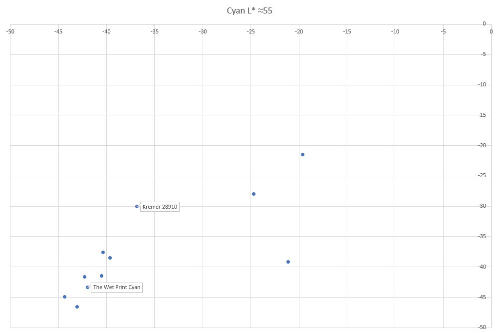
Chroma is how vibrant a color is. It is calculated from the Lab color space with pathagoras’ theorem by taking the square root of a2 plus b2. The further out from 0, the more vibrant the color. In the chart above the lower left pigments have a high chroma and the upper right have a low chroma. While The Wet Print cyan doesn’t have the absolute highest chroma of these samples, the other two caused staining.

If the dispersion happens to pass all these tests there is still a chance it will cause some sort of other problem with gelatin in the tissue. These can range from emulsions that have an extremely rough surface, the formation of crystalline structures, bubbles, oil streaks, or unwanted hardening. A good tissue should be smooth and glossy, free from any defects.

Storing the dispersions in the correct container makes a world of difference. If they are stored in a bottle, the pigments start to dry out which changes the weight to pigment ratio and makes calibration very difficult. When stored in large bottle like the Indian Ink, the ink dries on the inside of the bottle which will cause very small agglomerates even if shaken often. The Wet Print color pastes come in 100g plastic pouches or 50g aluminum watercolor tubes.
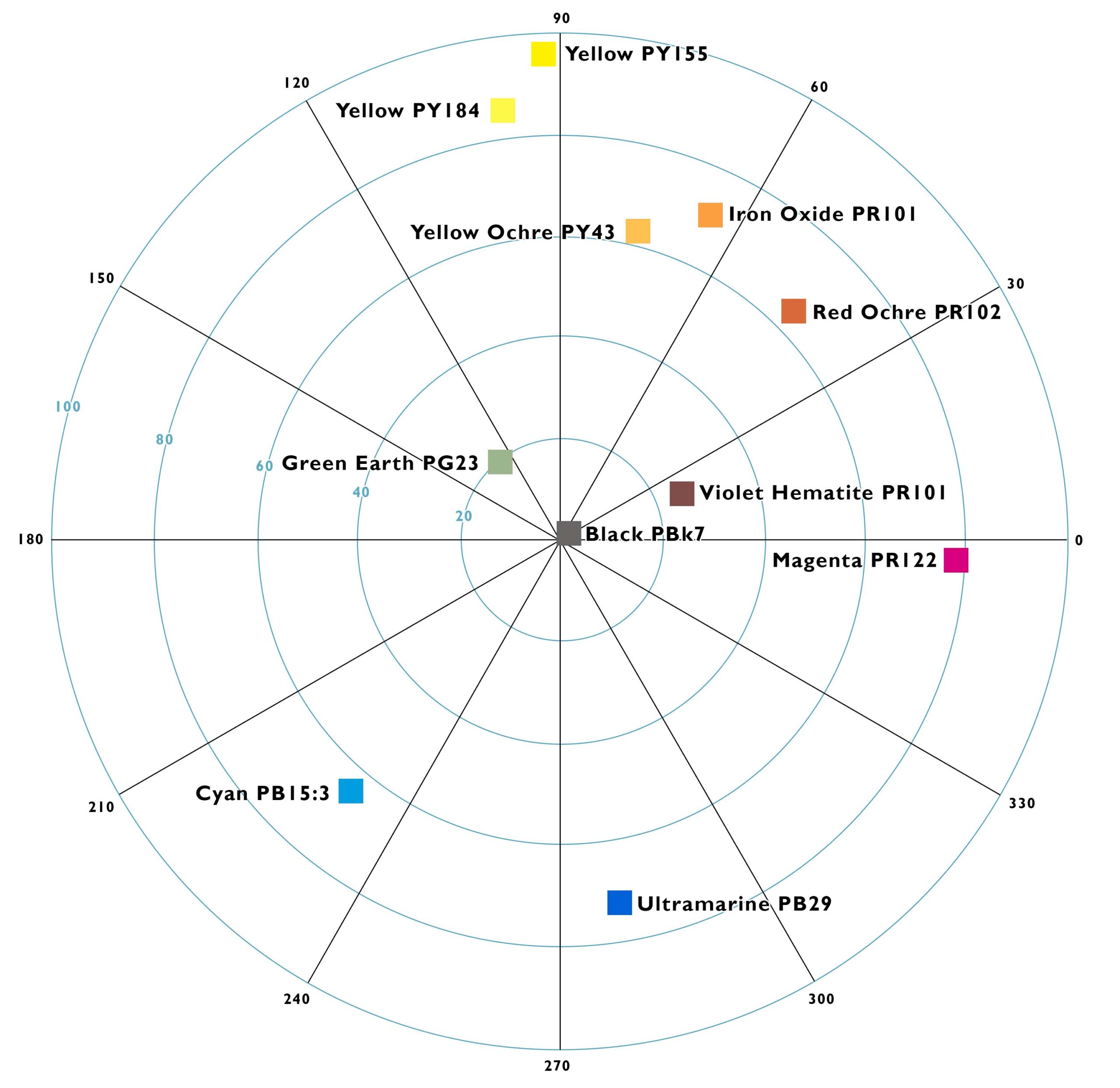
With advancements in profiling, editing software, and color science, it’s easier than ever to create and calibrate photographic prints that are not built from cyan, magenta, yellow, and black. We are free to break the mold, crafting works of art from an endless variety of pigments. Here are some examples-
• Earth pigments like red and yellow ochre, green earth, and lapis lazuli will create a very natural palette.
• The use of an iron oxide layer in addition to CMYK will greatly reduce metameric failure and color casts in portraits.
• The incorporation of brilliant green, violet, orange, or red pigments will greatly extend the gamut of a CMYK process. (Research into pigments for extended gamut is underway)
Designing a profile starts with choosing a palette. What pigments do we want to work with and what gamut will those pigments produce? After choosing pigments, the process of calibration can be divided into four parts, which are covered in Calibration for Alternative Photographic Processes. Once the profile is created, it’s easy to convert any RGB image in channels corresponding to the colors you chose for the palette.
Pigment choice is also important when toning prints. For example, the iron oxide and yellow ochre pigments are close in color, but the effect when toning a print is very different.
Brightly colored naturally occurring pigments are hard to find, so the price of these pigments tends to be higher. For example the price for the synthetic violet hematite in this store is almost half the price of the naturally occurring version. Natural ultramarine would be extravagantly expensive, so I use synthetic ultramarine, but if you are interested in the natural version, feel free to contact me. I have indicated which pigments are natural, and I guarantee they are what I say they are. Unlike Daniel Smith, which sells genuine purpurite, but it’s really just a much cheaper synthetic version. (https://www.instagram.com/p/CN9iDipFNT0/). There is a large variation in naturally occurring pigments, so I have purchased just about every one I could find, and tested them all for the attributes mentioned above. Below are just the red ochres I tested.
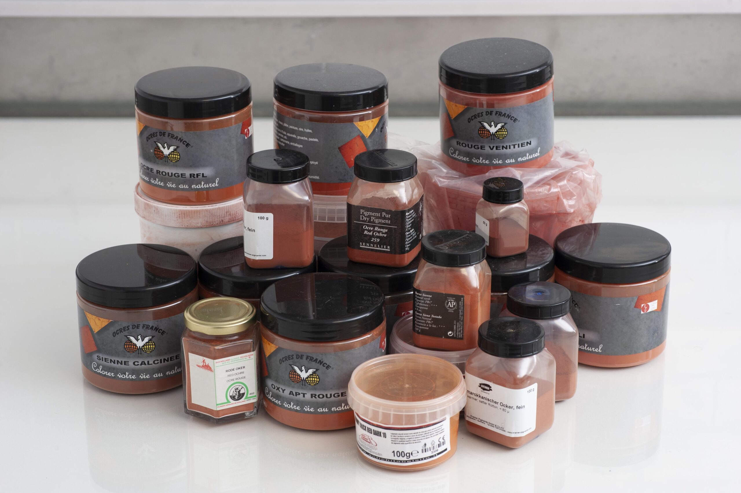
I could tell you which is the best, but it still wouldn’t be anywhere as good as The Wet Print color pastes. Why? These pigments are not finely ground. I further process these pigments in a planetary ball mill with zirconia jars and grinding media. The result is a more chromatic pigment that is also easier to work with.
Sourcing these pigments is sometimes very labor intensive, which is definitely the case with the natural violet hematite. Below are some photos of Jonathan Wright crawling 80 meters down to collect ore from veins of violet hematite. 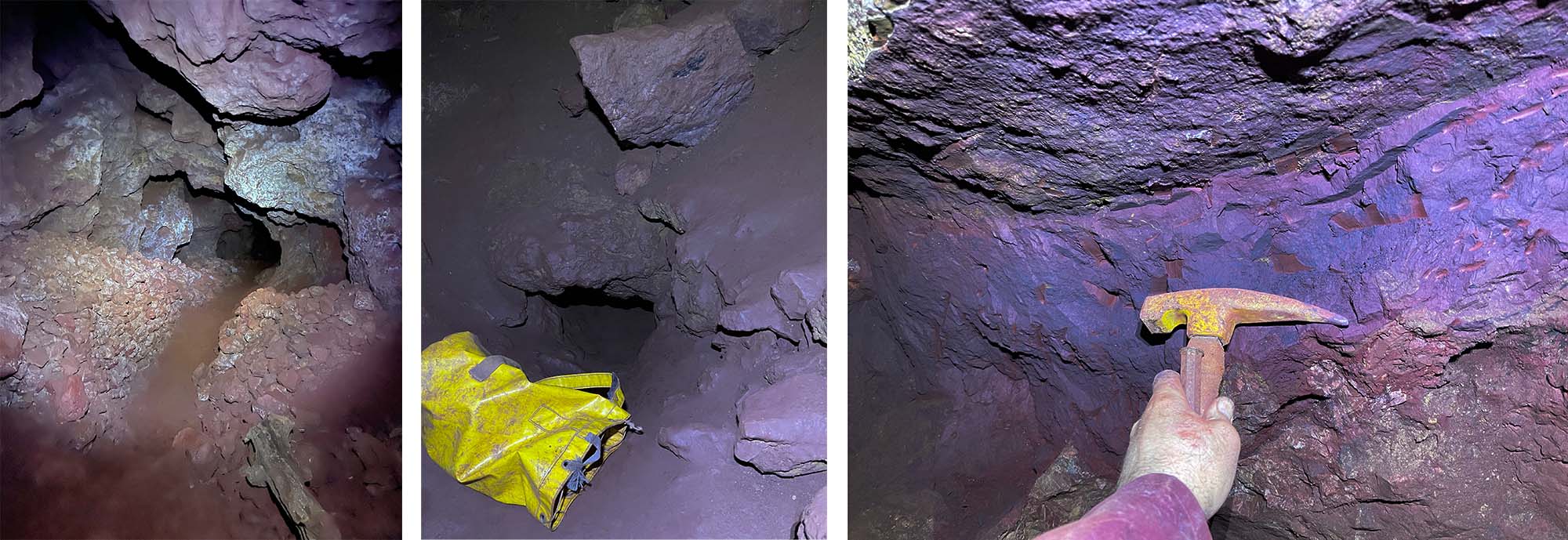
More information about pigments, and how to properly use The Wet Print color pastes, can be found in the Technical Guide to Gum Printing- https://printmakersfriend.com/gum/
Bruce MacEvoy’s website Handprint is also a great resource to learn about pigments- https://www.handprint.com/HP/WCL/water.html, as well as http://www.artiscreation.com/
| Weight | 0.5 kg |
|---|---|
| Dimensions | 20 × 10 × 2 cm |
| Choice | Cyan, Magenta, Yellow, Yellow PY155, Black, Iron Oxide, Natural Yellow Ochre, Natural Red Ochre, Natural Violet Hematite, Violet Hematite, Ultramarine, Natural Green Earth |
Reviews
There are no reviews yet.